Background
Farmforte is an
impact oriented value
chain development firm
Farmforte is an
impact oriented value
chain development firm
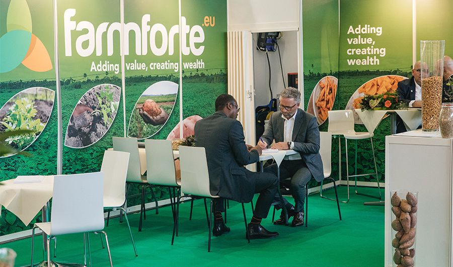
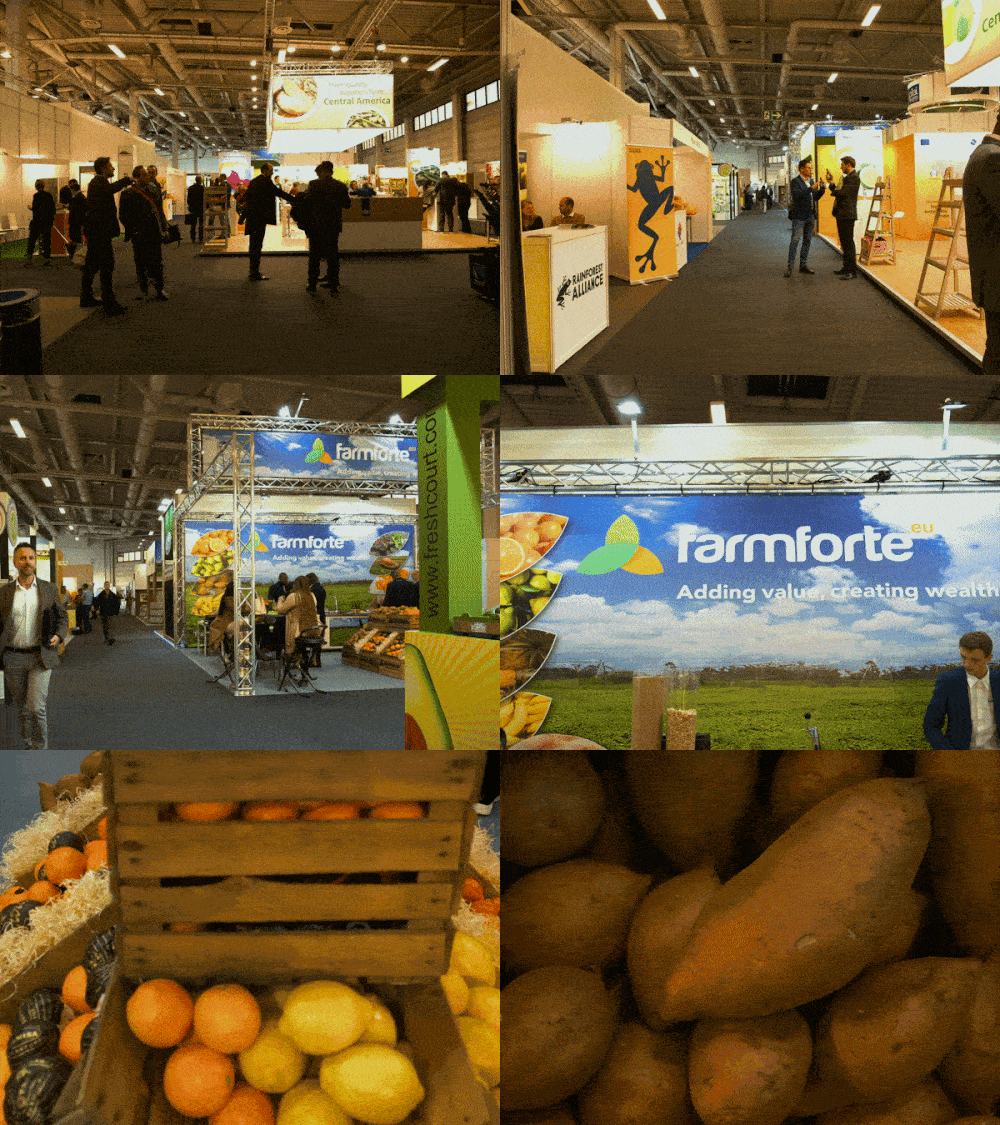
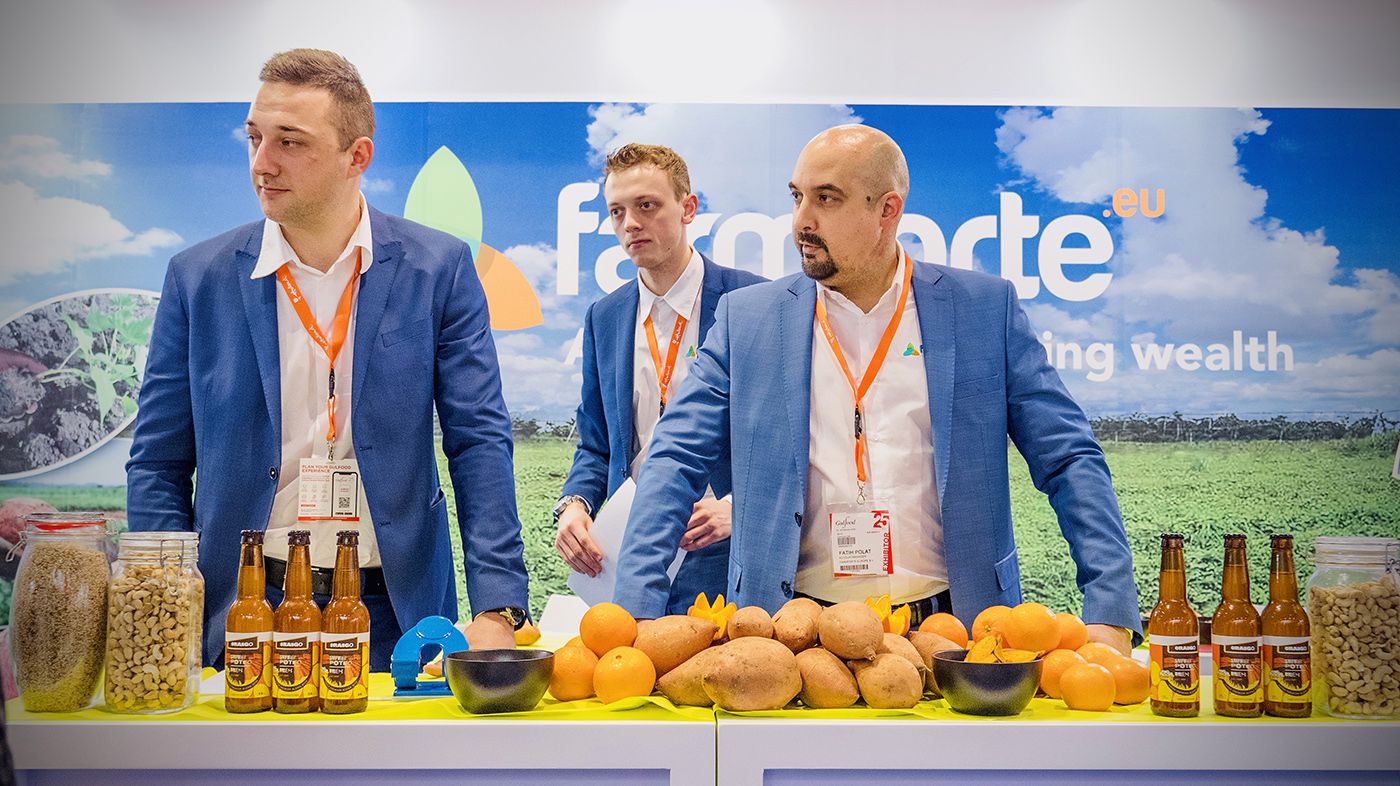
focused on creating novel solutions to existing problems in the African Agriculture landscape and transforming them to economic opportunities.
Farmforte was founded on the motivation derived from several years of research and data collection on the Agricultural landscape in West Africa. With a belief that Africa holds the key to meeting the increasing global demand for food, Farmforte is creating outstanding solutions that would impact the food chain globally both now and in years to come by unlocking the potential of the agricultural sector.
old Logo
New Logo
The Challenge
When the firm approached Check DC, it was a successful business that its approach to agriculture had been lauded for its uniqueness. This was as a result of the fact that they played across the value chain of specific well researched agricultural produce types, in which Nigeria has an unmatched comparative advantage.
The company was not actively promoting how its unique operations and values benefited the community. Seeking to grow the company’s visibility, they sought our assistance in bringing the company’s unique value to the forefront of their marketing efforts through a refreshed brand.
Logo
ORIGINAL TYPEFACE

EDITS TO THE TYPEFACE
Kerning
Curved Edges
Height Adjustment
The Solution
We began the rebrand project with an assessment that involved meeting with the Farmforte’s Co-Founder Osayi Osazuwa, conducting interviews with current clients and partners, researching competitors and their products.
Three Rings
Wind Mill
The new Farmforte brand mark is designed to depict a combination of two key elements:
-
Three Rings: Symbolizing the three entities brought together by Farmforte for global impact. Investors, Smallholder farmers and Farmforte
-
Wind Mill: Symbolizing the use of innovative systems as well as tech to improve the yield of smallholder famers in order to compete on the global landscape.
The logo
#1d3b2d
RGB: 29 // 59 // 45
#8dc63f
RGB: 141 // 198 // 63
#e67e22
RGB: 230 // 126 // 34
#2bb673
RGB: 43 // 182 // 115
#b1ddce
RGB: 177 // 221 // 206
We developed a bright and vibrant color palette consisting primarily of green, lemon and orange. The wordmark was initially developed with Harabara Mais type face and then edited while the brand’s font is Avenir.
Brand Font
